Process
A flexible process was used for the project, whose scope was initially uncertain. Our activities have been grouped according to the phases of the British Design Council Double Diamond process for clarity. Click below to skip to a stage in the project if you wish:

Discover
At the outset of the project a current website existed, along with a larger ecosystem of digital systems. Our project was also preceded by a number of other work streams which may have included research that could be relevant to us. Rather than than trying to re-invent the wheel, we decided a cost effective approach would be to:
- Hold face-to-face workshops with stakeholders to better understand the project space, wider ecosystem and previous work.
- Conduct a thorough review of available research material.
- Identify any gaps that might exist and plan additional research as needed to fill these.
Workshops
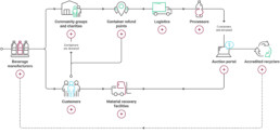
The first step in our workshops was to gain a good appreciation of the CFC scheme lifecycle, including an understanding of the role played by customers (the public), return point operators, logistics providers, processing partners and government and NGO stakeholders – each of these groups may potentially be part of the audience for the new website.
We sought to understand the nature of the interactions each group had with CFC, the sort information they might require in the course of their interactions, and the various digital CFC systems which they interacted with.
Research review
I conducted a thorough review of existing documentation, searching for insights which might be relevant to the current project.This included analytics reports from the existing site, outputs from the recently completed CX audit and UX research relating to a CFC mobile app which had been produced as part of a previous work stream.
Key conclusions
Some key insights which came from the discovery were:
- Groups who might have cause to use the Containers For Change website included: Customers (the public), current or prospective partners (refund point operators, logistics providers, recycling processors), and stakeholders (government and NGO).
- Customers’ motivations for using the scheme were diverse, ranging from earning extra money, to cleaning up the environment, to helping fund local social initiatives.
- Analytics from the existing website suggested customers’ main need was quick, frictionless access to practical scheme information such as return point locations and container eligibility.
- Analytics from the existing website suggested customers’ main need was quick, frictionless access to practical scheme information such as return point locations and container eligibility.
- A priority business goal resulting from the CX audit was to drive growth by increasing customer engagement in the scheme (encouraging them to register for an account and collect more containers) and by promoting use of the scheme for community group fundraising.
Define
By the end of our initial discovery phase the list of audiences the website would serve, goals it would aim to fulfil and systems it would integrate with, appeared to be ballooning. We needed to clarify the website scope and prioritise its goals.
Clarifying scope and goals
I designed and led a workshop with the key clients to bring clarity to the project – we would collaboratively map and prioritise proposed website goals against CFC business objectives agreed as part of the higher-level CX audit.
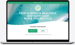
In the workshop we established that the website would primarily be a customer-facing website, with other audiences most appropriately targeted via other touch points. Key goals of the website would be:
- Onboarding new customers to the scheme – educating them on how it works and encouraging them to register for an account.
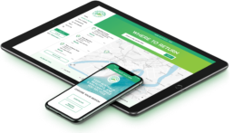
- Providing tools to customers to enable them to use the scheme – for example they would need to locate return points, and check container eligibility.
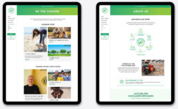
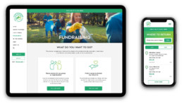
- Encourage and support customers to be more active in the scheme, with a particular emphasis on driving customers to become super-users of the scheme, or to user the scheme for community fundraising (key growth areas for the business).
Design principles
We now had client agreement over the goals of the website, but I noted a tension between what we had identified as the primary user need (frictionless, uncluttered access to practical scheme information) and the primary business goal (driving engagement and promoting alternative uses of the scheme such as fundraising).
I suspected that these opposing requirements might lead to disagreement down the line on what we should be prioritising in the design – to pre-empt this I drew up a set of design principles which would be agreed with the client before moving forward.
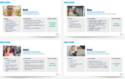
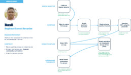
Personas
We now knew that the website would be predominantly customer-facing and that one of its primary goals would be to try and elicit behaviour change in customers. To do this would need to understand our audience and what motivated them. Using insights from the available research and in consultation with the client I created a series of representative personas which we would refer to throughout the design process.
Develop
Feature identification and user stories
Drawing on learnings from the discovery phase I assembled a feature identification spreadsheet and began writing user stories. As a team we conducted a sizing and MoSCoW analysis of these features, before agreeing on an MVP which would be our design goal.
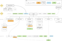
IA and user flows
I developed an Information Architecture for the site and in tandem started looking at users flows for some of our key personas. This was an important step in ensuring that our site design would be equally effective for both users looking for frictionless access to core scheme information, and users a broader education on the benefits of the scheme.
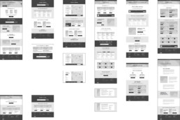
Wireframes
I created detailed wireframes for the complete site, these would be iterated several times before moving into visual design. Key challenges included;
- Incorporating coercive elements into the design which attempted to move users towards increased scheme engagement, whilst simultaneously ensuring this did not interfere with access to key scheme information.
- Ensuring the site design would be equally effective for our various personas – making sure each of them could easily get to the information they needed.
- Including a large amount of information about the scheme into the ‘how it works’ section whilst simultaneously making it appear simple and accessible.
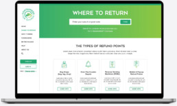
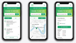
- Designing a first rate user experience for the return point locator (a map solution with postcode search) whilst working within very tight build constraints imposed by the chosen platform.
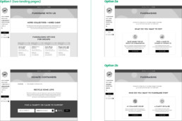
Remote user testing
We were faced with very tight budget constraints for user testing at this stage in the project, so I needed to ensure that our testing would be targeted to provide maximum value. I sought areas in which remote-testing with low fidelity prototypes could provide real insights. These were:
- The homepage layout – attempting to optimise the balance of signposting essential scheme information vs coercive driver elements.
- How it works – testing whether the chosen page structure would appear simple and accessible to users without preventing them from accessing more detailed information.
- Group fundraising pages – a priority for a business, but with potentially confusing content – testing could help establish the clearest way to structure the content for users.
There were other areas of the site which would benefit from testing, but it was agreed this could be more effectively be done using early build prototypes.
Deliver
Look and feel development
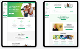
A colleague took the lead for initial development of the website look and feel concepts since she had worked as an art director on previous projects relating to the re-brand, however I worked closely with her to ensure concepts would meet the requirements determined through the UX process and advised on aspects such as WCAG compliance of the chosen colour schemes, ease of build and how the responsive behaviour of the site might work. I would later be responsible for completing UI designs for the remaining site pages.
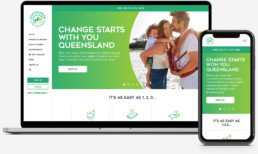
User Interface Design
Once look and feel had been signed off by the client I took the lead in flowing out build-ready UI designs across all pages. This was done by creating an atomic design system using Sketch. I collaborated closely with the lead developer throughout this process to ensure that designs would be achievable within the constraints of the platform selected for build and that design decisions would not jeopardise us completing the project within our tight budget.